WILKHAHN SWITZERLAND
Wilkhahn and the Evolution of Office Space
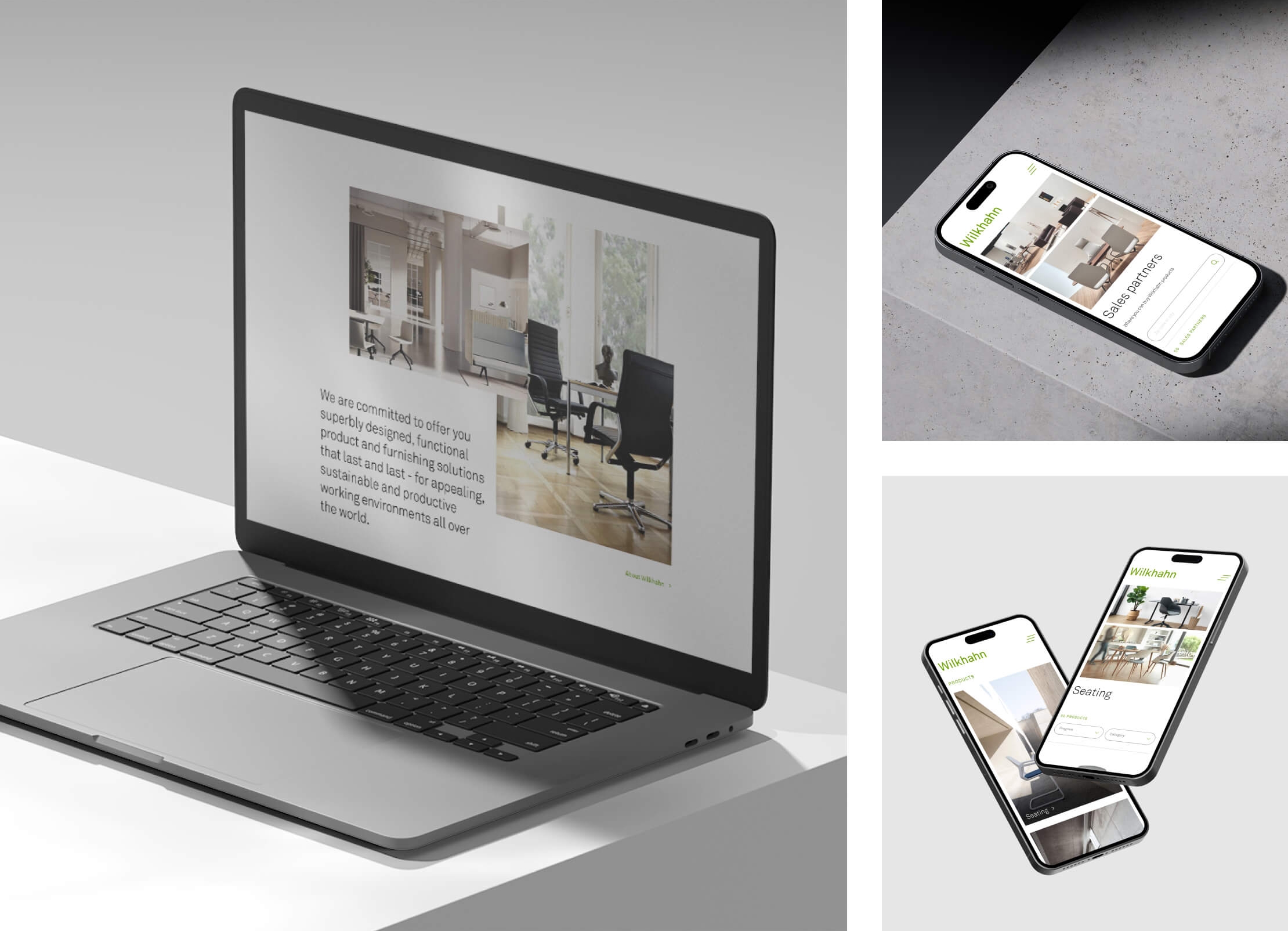
We had the opportunity to reinvent the Wilkhahn Switzerland website. With an improved UI design and plenty of room to showcase the furniture.
Wilkhahn Switzerland is one of our oldest clients. We have been supporting the company with communications since Sergeant was founded in 2009. As the website had become a little outdated, we took the opportunity to rethink the entire site.

A modern world of furniture
The result is a modern website - as contemporary and timeless as Wilkhahn furniture itself. Animations and interactive elements make the site more dynamic, while improved user guidance with a clear page structure makes it easier to navigate. And perhaps the most eye-catching new feature: much more space for generous product photography.
All the information on one page
We have developed a new UI design and reorganized the website to meet the needs of the target groups. Users no longer have to go to external sites for specific content, but can find all the information about the entire product range on the Swiss website.
Improved user experience
With new English and Italian translations, wilkhahn.ch is now available in four languages. But most importantly, the user experience has taken a quantum leap. New filters sort the product range by programme and category, and a product configurator is available for each programme line, allowing users to tailor their furniture to their own requirements.


