
ROD KOMMUNIKATION
Striking Simplicity for Rod Kommunikation
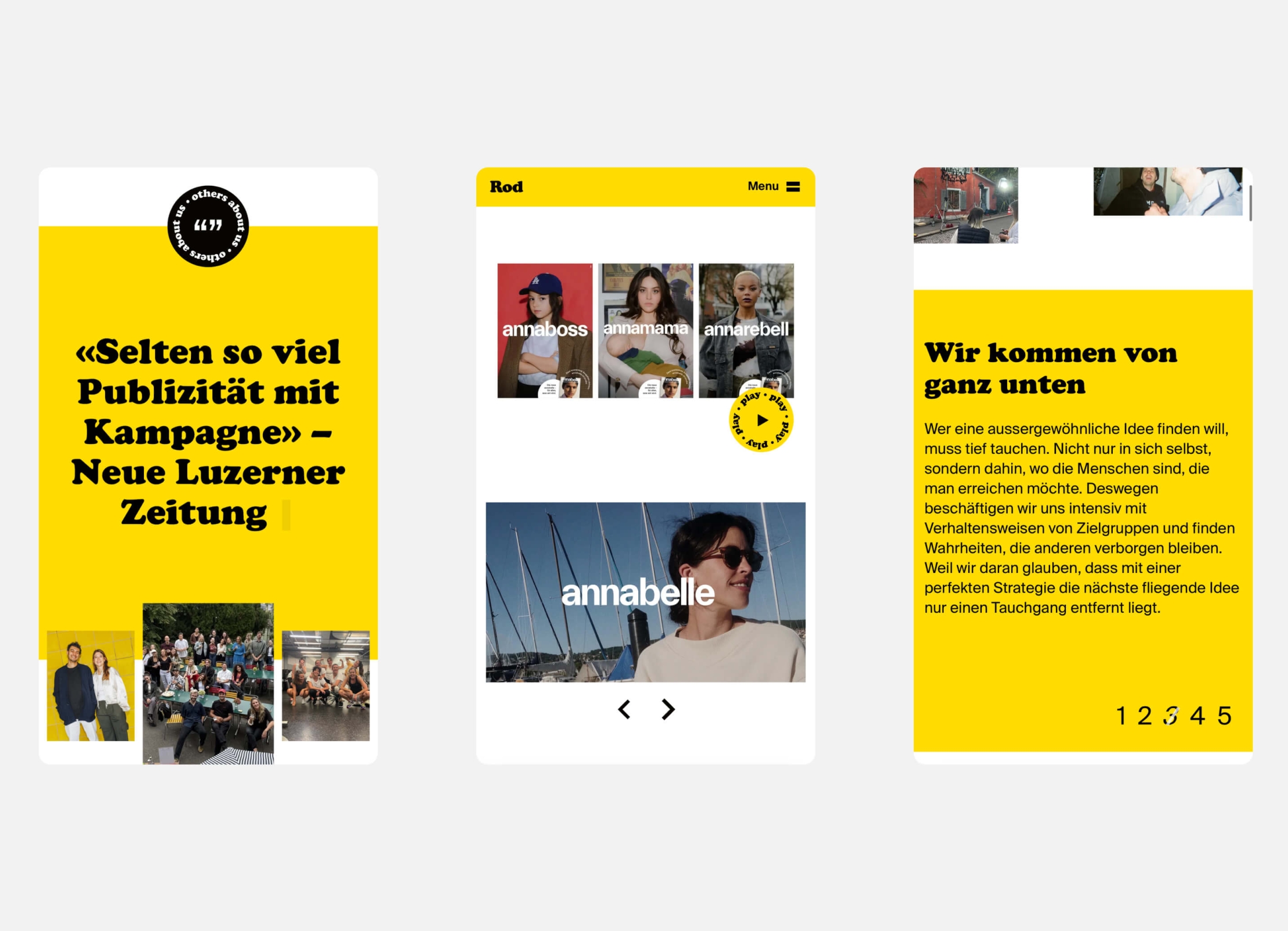
Rod is known for campaigns that hit home, fast. Their new website needed to do what any agency website should do: let the work speak for itself.
The agency's existing website had been online for 15 years, so the new site needed to be both contemporary and timeless. We trimmed the site and split it into two pages: Work and Agency. The campaigns take centre stage. They can be filtered by 'Now' (the most recent), 'Classics' (the best-known) and work done in collaboration with Team Farner.
Uncomplicated & welcoming
'A bigger bang for the buck' is Rod's motto. They make a lot out of a little. This was our guiding principle when designing the user experience and interface. With strong visuals, generous typography and a clear structure, we have created a distinctive look - with the brand's bold yellow colour and signature Cooper Black font doing the rest. The result is crisp and to the point, but with a dash of playfulness.
Flexible but solid
The backend needed to be as simple as the frontend. Rod wanted a practical CMS so they could easily update the cases and the team website. Based on our trusted Drupal Business Framework, we developed a modular system that scales well. It gives editors a lot of freedom without sacrificing performance or security.

