HOLCIM SWITZERLAND
Streamlining the corporate brochure
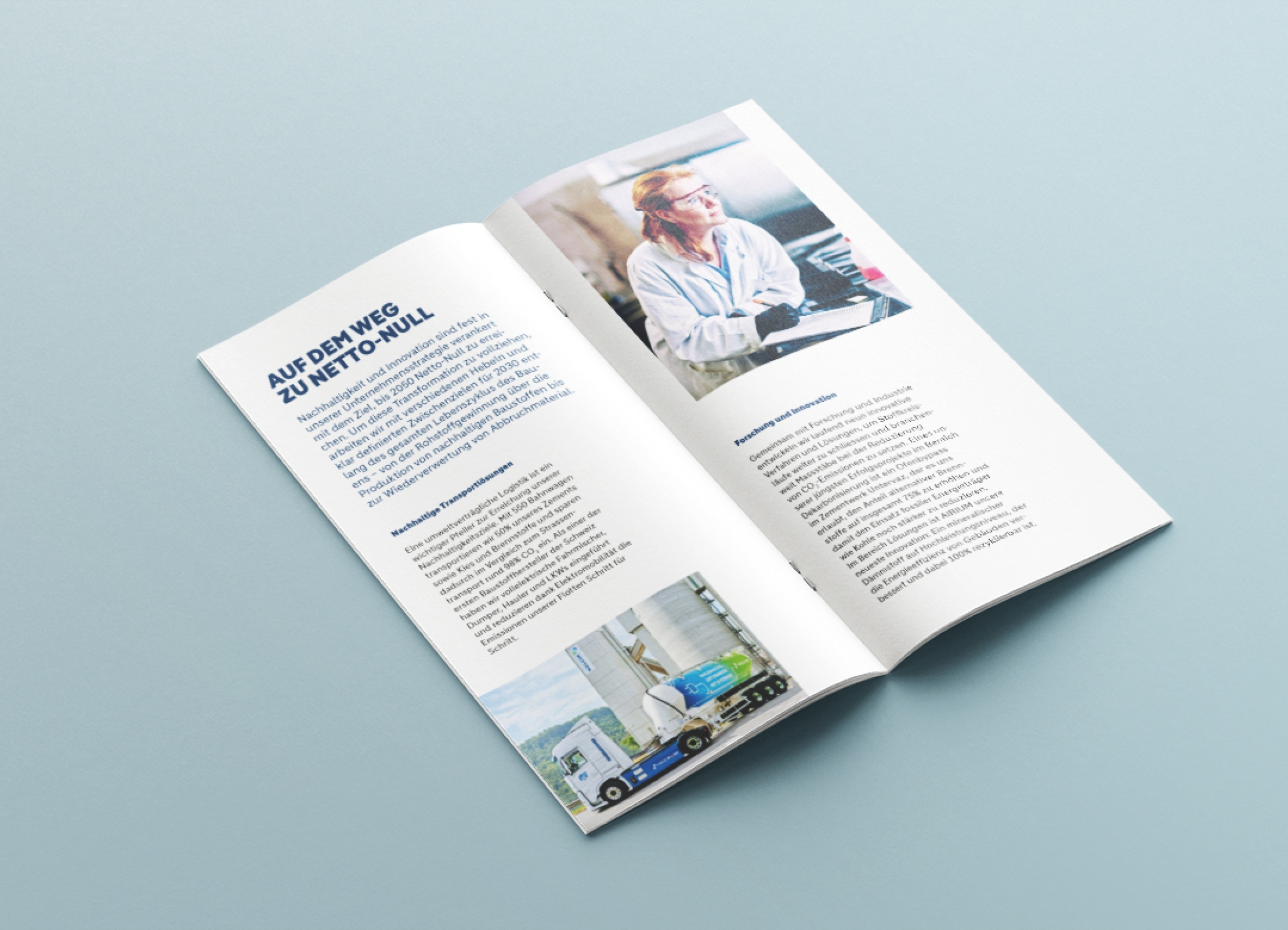
We refreshed the corporate brochure for Holcim Switzerland: Featuring the new branding, sharper positioning and generous use of images.
The "At a glance" brochure introduces Holcim Switzerland briefly and concisely: What does the company do, what are its priorities, what are its key figures, etc. Our task was clear: to update the brochure in terms of content and design. In other words, adapt it to the new positioning and rebranding.

The makeover started with the structure. To highlight Holcim Switzerland's new direction, the new brochure focuses on the topics of research, innovation and circular economy. We were pleased to support the project team in terms of content. For the design, we presented two distinct routes with different page types and flexible use of images.
The final product is a fresh and tidy upgrade of the company brochure. Trilingual, with a digital version including QR codes and a newly illustrated map of Switzerland.

