Lyreco
Getting Out of the Box with Lyreco
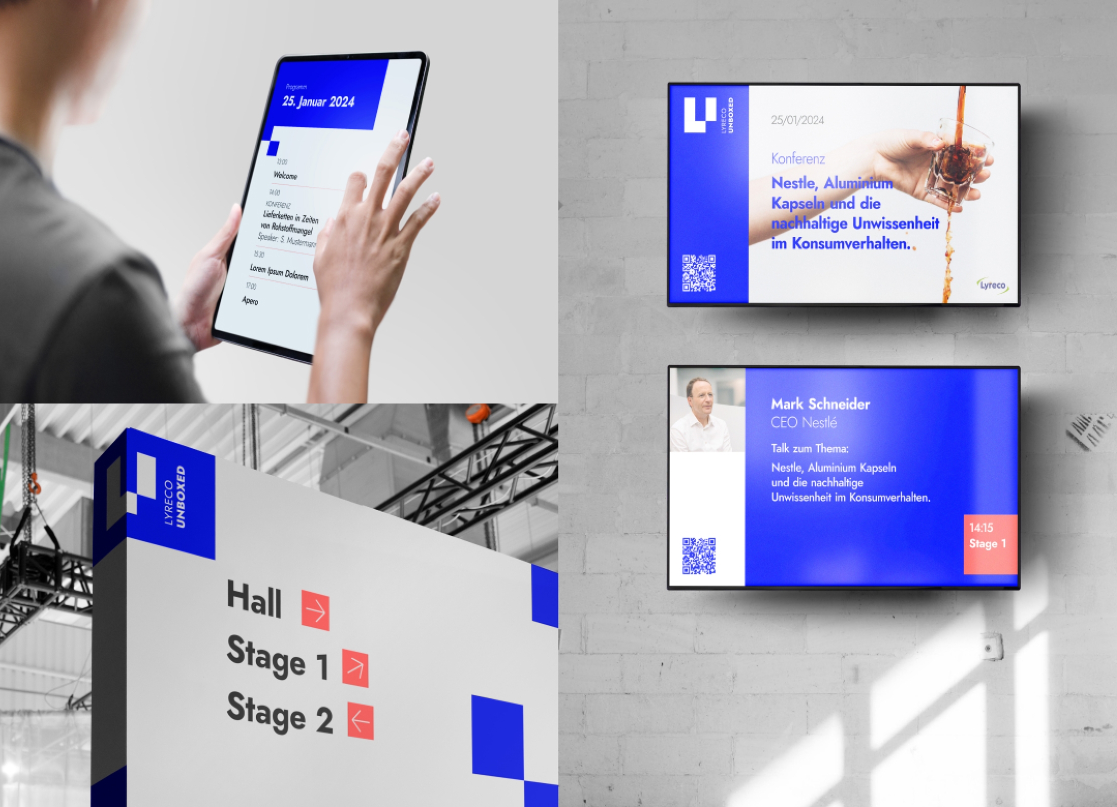
We Sergeants love unpacking Lyreco boxes: the notebooks, the pens, the coffee! But this time, instead of unboxing, we were asked to create an event identity for Lyreco Unboxed, a new format for customer events.
Since 1887, Lyreco has been supplying everything a workplace needs. They do so in the most sustainable way possible, in a reusable box that can be recycled and reused again and again. That's why the Lyreco Unboxed event is all about unpacking sustainability. The aim: to share knowledge and inspiration among the 1000 Lyreco customers invited. Our brief: to create an event identity that is flexible, recognisable and yet distinct from the corporate design.
Openness meets lightness
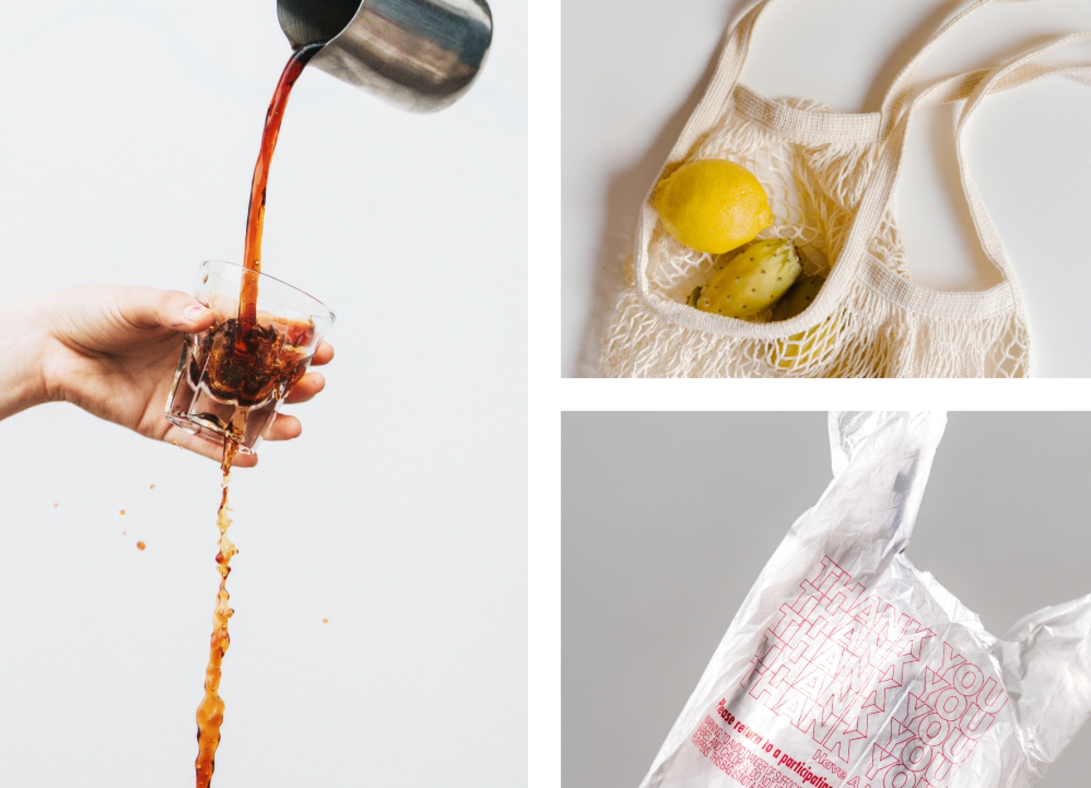
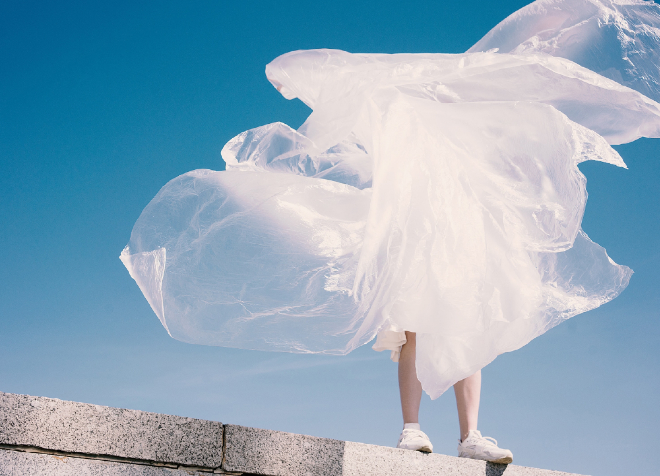
One thing quickly became clear: despite the topic, the design was not going to be a lot of green and even more plants. Inspired by the Lyreco brand, we instead chose a strong, vibrant blue for the logo. It features an open box or box-like shapes that move flexibly in animations. A symbol of the openness of the event. The imagery reinforces this idea with motifs that echo the themes in a light, modern visual language.
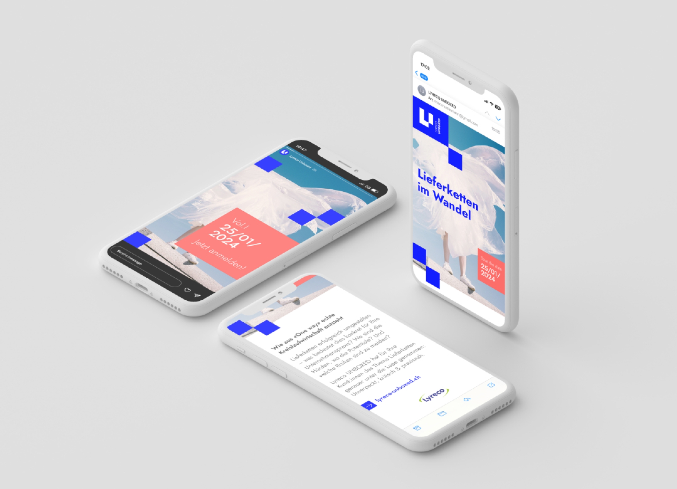
Flexible event identity
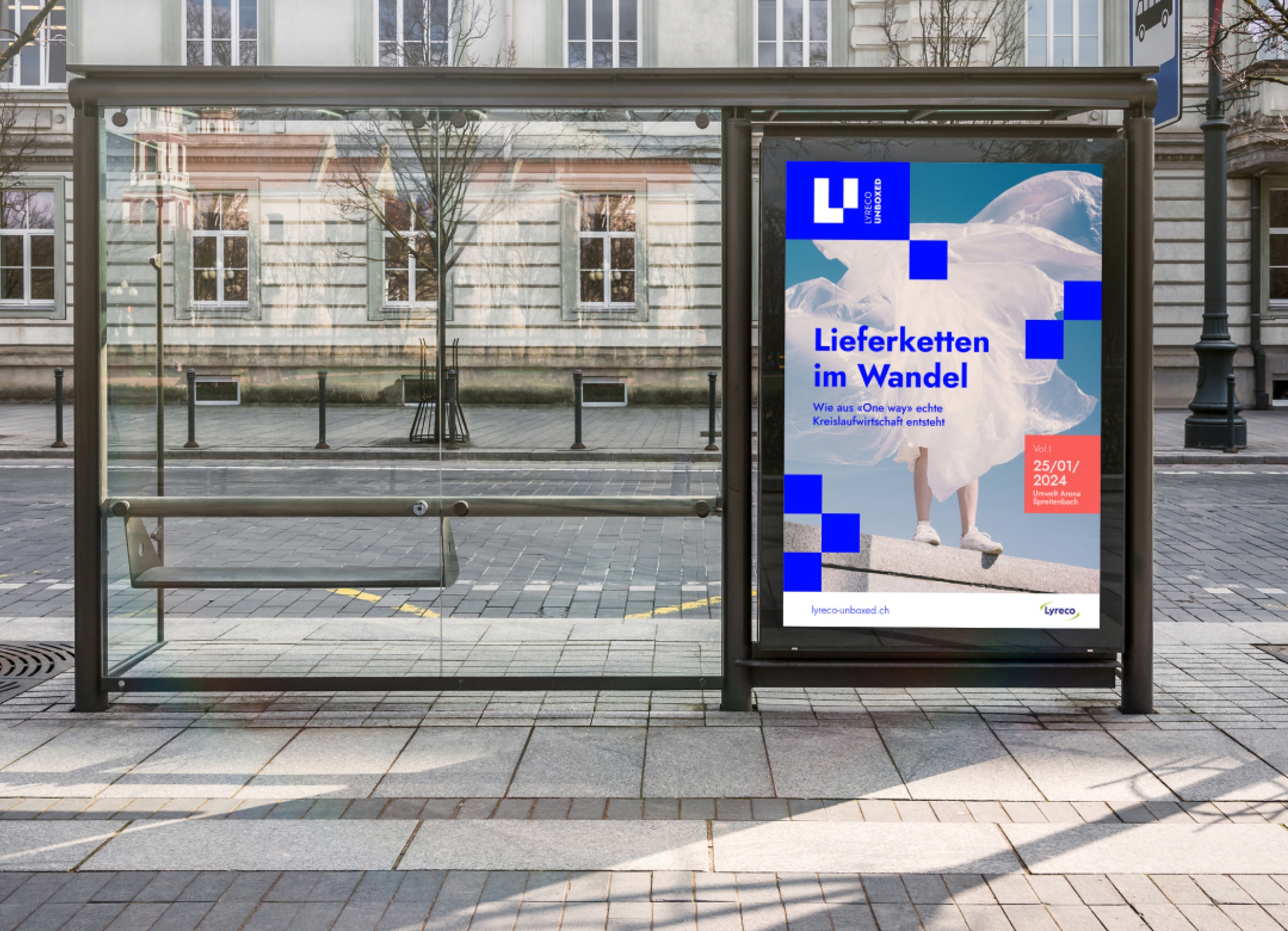
The unboxed format was developed by the brand experience experts at standing ovation. They were responsible for the overall concept. We developed a series of mock-ups for the event identity, which were then implemented by standing ovation: Posters, newsletters and Instagram stories for the awareness phase and signage, stage design, video animations, print applications and social media for the event itself.
